Getting Started
The first step in getting started is to select a default toolbar (Desktop: Changing the Current Toolbar). Each SirsiDynix Symphony module is represented with a wizard toolbar. Many activities can be performed using the Menu Bar. Wizards and helpers can be customized by setting WorkFlows properties (Understanding Properties).
Navigational tools such as alert windows and hypertext links allow you to move easily through WorkFlows.
The following elements are used throughout WorkFlows.
| • | Drop-down Lists |
| • | Gadgets |
| • | Glossaries or Hypertext Links |
| • | Helper Bar |
| • | Information Buttons |
| • | Insert Mode |
| • | Right-click Menus |
| • | Special Information Windows and Alerts |
| • | Tabs |
| • | Toolbar |
| • | Toolbox |
| • | Wizard Tabs |
| • | Wizard Windows |
| • | WorkFlows Window Captions |
Indicated by the arrow icon  , drop-down lists make selecting field values and policy values easier. The lists present valid values for the wizard fields.
There are two types of drop-down list (or verify list) fields:
| • | Some drop-down list fields cannot be edited. The lists are populated with policy-controlled values or preset values. Most drop-down lists are of this type. |
| • | Some drop-down list fields can be edited. The lists are populated with preset values, but you can also type values. The most common example of this kind of field is an ID field. |
Non-editable Drop-down List Fields
For drop-down list fields that cannot be edited, you can select values as follows:
| 1 | Click the arrow button. |
| 2 | Click one of the values in the list to select it. |
| 3 | Or, if you start to type a value name, the wizard jumps to that value in the list. Click the value to select it. |
When you start to type a value name, the drop-down list behaves in a standard Windows manner. When you type a partial match that will always result in a list (for instance, if you type one letter), you will start in the list at that letter. If you type in three letters, you will start in the list at the first match for those three letters and be able to scroll down the list from that point. If you type a whole text string, you would still be able to see the text strings following it.
For example, these policy names are available: AAA, ABA, ABB, ABC, ABD, and BCD.
| • | When you type A, the list starts at AAA. |
| • | Next, type B, and the list selects ABA. |
| • | Then, type C, and the list selects ABC. |
In order to start selecting policies that start with B, you will need to press BACKSPACE three times to remove ABC and type B, or press the UP/DOWN ARROW keys.
Editable Drop-down List Fields
For drop-down list fields that can be edited, you can select values as follows:
| 1 | Click the arrow button. |
| 2 | Click one of the values in the list to select it. |
| 3 | Or, if you start to type a value name, and the value with the shortest string length is selected to automatically complete the field. |
| 4 | Or, you can type a value not found in the list. |

If you press the Backspace key to remove a typed character, the auto-completed portion of the value is removed, and only the characters you typed remain in the field. Further use of the Backspace key will remove the typed characters. Auto-completion does not take place during backspacing; it only occurs when characters are typed.
Indicated by the gadget icon  , these tools make selecting field values easier. These gadgets can be used to select information such as date and time ranges, policy values, or monetary amounts. You may use a gadget by clicking the gadget icon with the mouse or by pressing the TAB key to select the gadget and then pressing ENTER to open it. For more information, see the specific gadget topics, such as Date Range Gadget, Minimum/Maximum Gadget, and Number Range Gadget. Gadgets also have context-sensitive help links.
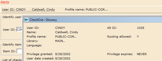
Information underlined with a dashed line will display a glossary when you click it. For example, when checking out items to a user, you can display detailed user information by clicking the user’s name.
Example of a user glossary:
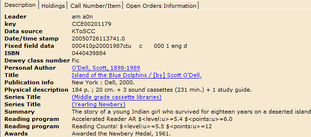
Information underlined with a solid line will perform a hypertext search when you click it. For instance, if you searched a title in the Item Search and Display wizard, and in the title description the author’s name is underlined, you can click the author’s name to perform a search of other titles written by that author.
Examples of hypertext entries in a bibliographic record:
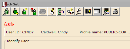
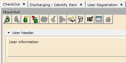
The Helper bar is positioned horizontally across the top of the WorkFlows client interface, just below the active window’s title bar. Helpers listed on the left side of the bar primarily make it easier to access necessary information needed by the current wizard. For example, Checkout wizard uses the following helpers: Lookup User, Register New User, User Lost Card, Pay Bills, Add Temporary Title, Confirm Address, Replace Item Barcode, Special Due Date, and Renew Privilege. For more information about helpers, search the specific helper topic. Helpers have context-sensitive links to help topics.
Example helper bar available in the Checkout wizard:

Helpers may also be available under a tab with variable length data, such as a user’s address. These helpers are used when adding or deleting field information. The Create First Row Helper, Insert Row Before Helper, Insert Row After Helper, and Delete Row Helper may be available.
Additional information about a data element may display when you click a button that contains underlined text. For example, when a user is displayed, the user’s name and ID displays underlined on a button above the various information tabs. When clicked, a brief user summary displays.
The WorkFlows client currently defaults to Insert mode on both Windows and Macintosh operating systems. On a Windows PC, you may use the Insert key to toggle between the Insert and Overstrike mode in the Cataloging wizards only.
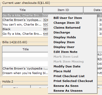
WorkFlows supports right-click menus for wizards and other WorkFlows functions. These right-click menus are popup or shortcut menus that contain commands and options that can be performed against a selected record or group of records. The right-click menus are available using a mouse right-click in circulation lists (or tables), such as checkouts, bills, holds, bookings, and more.
Once in a right-click menu, you can click a circulation or print option, or use CTRL+ the underlined character to access an option.
Special Information Windows and Alerts
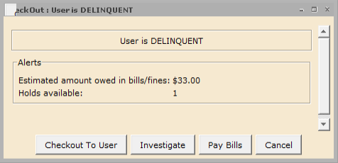
Special information windows will display any alerts, warnings, or system messages. Information about a user’s status is a typical library alert. For example, in the circulation wizard, an underlined, red “Alerts” message may display. Click the message and a glossary displays the alerts for that user.
Example “Alert” message in the Checkout wizard:
When you click the “Alert” message, a window like the following opens:
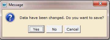
Dialog boxes may appear that require you to acknowledge a warning or message before continuing with the wizard. Click OK or press ENTER to close most dialog boxes. Some dialogs include other actions. In the following example, you can click Yes, No, or Cancel to close the dialog box. Or, you can press ENTER to accept the default action.
Example dialog box:
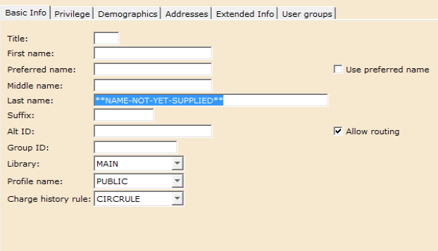
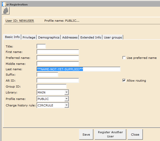
Most of the data managed by WorkFlows is managed using categorized tabs. You can access data by clicking the folder’s tab. The tabs that display depend on which WorkFlows modules your site has been configured to use and how properties are configured for the individual wizards.
Example tabs in the New User Registration wizard:
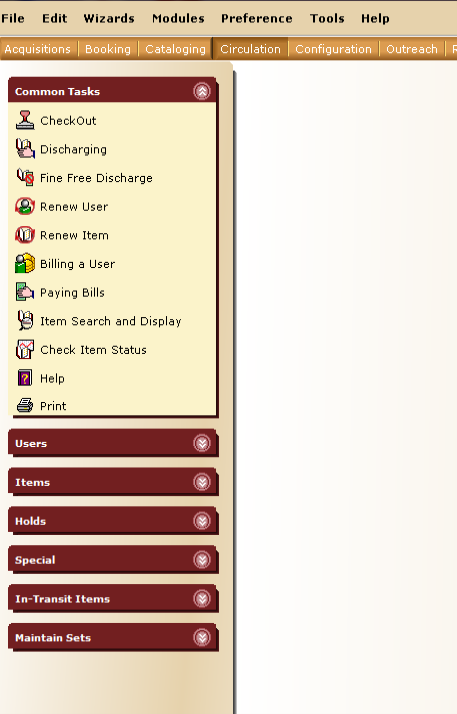
Toolbars display series of wizards commonly used for library functions. For instance, the Circulation toolbar displays circulation wizards such as the Check Out wizard and Discharge/Checkin wizard, and user wizards such as the New User Registration wizard and Modify a User wizard. Your system contains a delivered set of toolbars, however, toolbars can be customized using the Toolbar Management: Modifying a Toolbar feature.
Select a toolbar by clicking the toolbar name at the top of the client window. Or, you can select the current toolbar using the Preference Menu. In Classic Themes mode, you can right-click a toolbar and select Select Current Toolbar in the shortcut menu.
In Classic Themes mode, you can determine where the toolbar will appear on the screen by using the standard Windows click and drag feature. By default, the toolbar displays at the top of the client window. Click a toolbar, then drag the toolbar to the left or right side to display it vertically, or to the top or bottom to display it horizontally. The toolbar position is saved when you exit the workstation.
In Desktop Preferences, you can set the default toolbar that appears when logging in to WorkFlows.
Example Circulation toolbar:
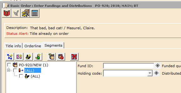
A toolbox will appear in the upper left corner of some wizard tabs. This toolbox will contain tools that assist you in creating, modifying, duplicating, or removing tab information. For example, the Claimed tab in serial control wizards will display the Create a Claim, Change an Issue, and Remove Claim (s) tools in the tab toolbox. See the specific tool help topics for more information about these tools.
Example toolbox on the Segments tab of the Add Basic Order wizard:
Wizard tabs allow users to display multiple wizard tabs within a single window. Each wizard tab carries the name of the wizard and can be closed by clicking the close icon on the right side of each tab or pressing CTRL + W. When a tab is selected, the wizard becomes the active wizard and the wizard name is displayed in the window caption. Users can customize their client’s wizard tabs to display on either the top or the bottom of the window.
Example wizard tab:
Wizard windows display the work “templates” for the wizard functions. It is possible to have multiple windows open at one time. On Windows workstations, you can minimize, maximize, or close the windows using the standard Microsoft Windows buttons that display in the top right corner. To maximize a window you’ve minimized, first click the window to set the cursor focus, then click the Maximize icon. (The window that has cursor focus will appear grey.)
You can modify the arrangement of multiple windows using the Window menu. The Window menu is only available Classic Themes mode, or if the Multiple Windows Mode check box is selected in Preferences/Desktop Setup for other Themes modes.
These functions also apply to helper, gadget, and tool windows.
Example wizard window:
The WorkFlows client windows will reflect the wizard name and subsequent wizard actions in the main window caption. When you open a wizard, that wizard’s name will display at the top of the WorkFlows main window, next to the SirsiDynix Symphony WorkFlows logo (top left corner). As new windows open within the wizard flow, or when message or confirmation dialog boxes open, the caption will reflect the wizard name, a colon, then wizard action/message/confirmation. When multiple windows are open, the window name that is active (in focus) will display in the caption.
For example, when you open the Checkout wizard, the caption will say “SirsiDynix Symphony WorkFlows : Checkout.” When an alert message displays for a patron during checkout, the caption could say “SirsiDynix Symphony WorkFlows : Checkout : User is DELINQUENT.”
This feature supports screen readers and RFID applications, allowing them to more easily read where the WorkFlows user is in the wizard flow.